React Native Ficus UI
React Native UI library forked from Magnus UI and inspired by Chakra UI.
🎉 Beta version available ! 🎉
Currently v1.0.0-beta7
Style props
React Native Ficus UI allows you to pass all the style properties as component props. You don't need to create huge StyleSheet objects.
Theme support
You can edit the components sizes, colors, borders, ... with your own theme.
Chakra UI & React Native
React Native Ficus UI provides the support of style props on React Native components and some components implemented as from Chakra UI (with same API).
Style props
You can use style props to directly apply specific styles to components, simplifying code and improving readability.
<Input placeholder="Username" p={10}
    focusBorderColor="blue.500" suffix={<Icon
    name="search" color="gray.900"
    fontFamily="Feather" />}/>
Theme support
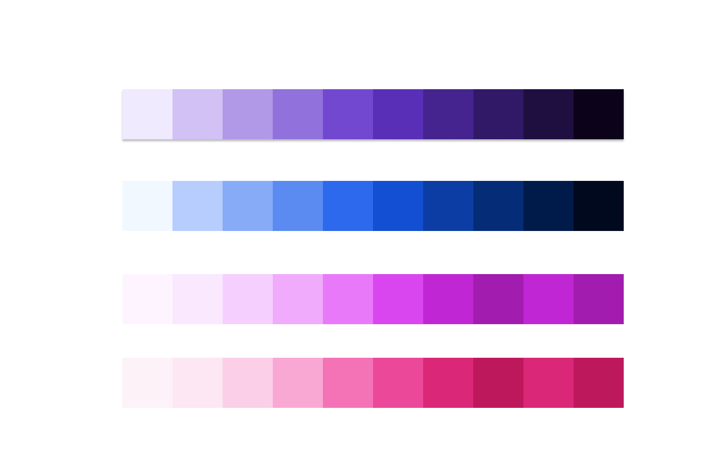
In Ficus UI, customization options include modifying theme tokens like colors and font sizes and adjusting component styles such as base styles and sizes, and customizing global styles for universal application.
ColorsSpacing
const theme = {
            colors: {
              violet: {
                50: '#f0eaff',
                100: '#d1c1f4',
                200: '#b199e7',
                300: '#9171dc',
                400: '#7248d0',
                500: '#592fb7',
                600: '#45248f',
                700: '#311968',
                800: '#1e0f40',
                900: '#0c031b',
            },
              Blue: {
                50: '#e3eeff',
                100: '#b6cdfe',
                200: '#88abf7',
                300: '#5b8af1',
                400: '#2d69ec',
                500: '#134fd2',
                600: '#0b3da4',
                700: '#052c77',
                800: '#001a4a',
                900: '#00091e',
            }

        }
      }
Chakra UI and React Native components
You can style your components using StyleSheet. create or style props directly, providing flexibility in how you manage and apply styles according to your preferences.
<Text fontSize="xs" style={{ color: 'blue',
     padding: '10px', fontWeight: 'bold',
     textDecoration: 'underline' }}>Ficus UI
     </Text>
Test it out live!
Discover components live with Expo. Experiment with interactive features for an immersive development experience.